IMAGE CREATION / CHARACTER DESIGN
STREETWEAR
MANGA.
Your character. Their world. A graphic built around both.
Transform a character sheet into a distressed manga T-shirt back graphic, with layered portraits, character specific symbols, typography, and environmental storytelling.
GET THE PROMPT ↓THE FINISHED LOOK
02 EXAMPLESOne template, two distinct identities. Select an image to view the original at full size.
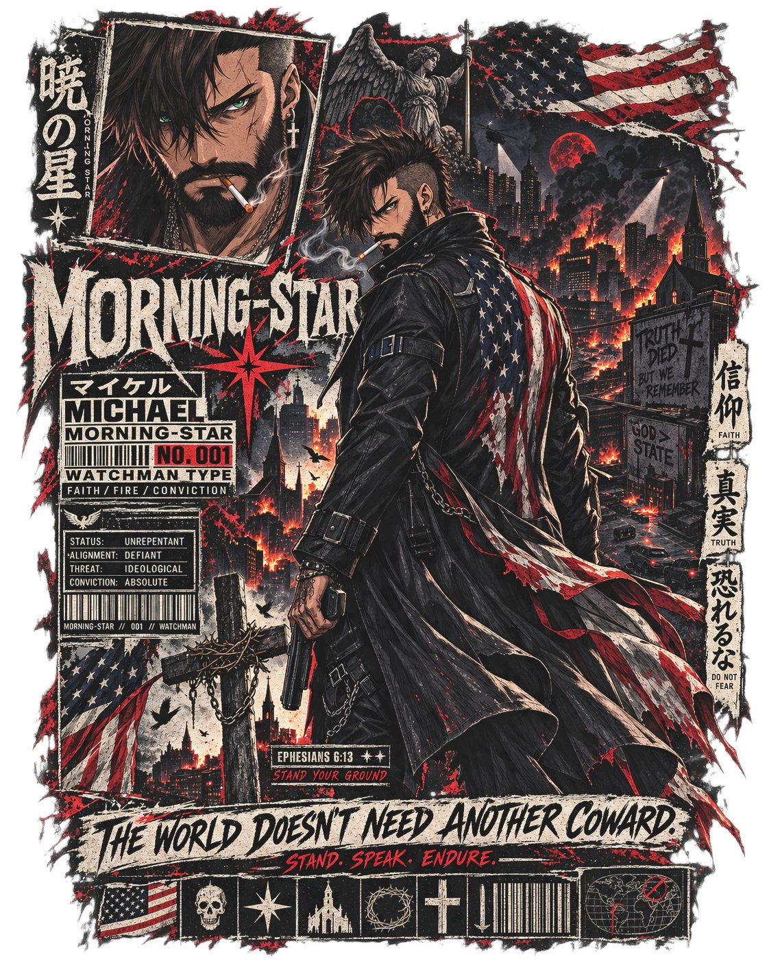
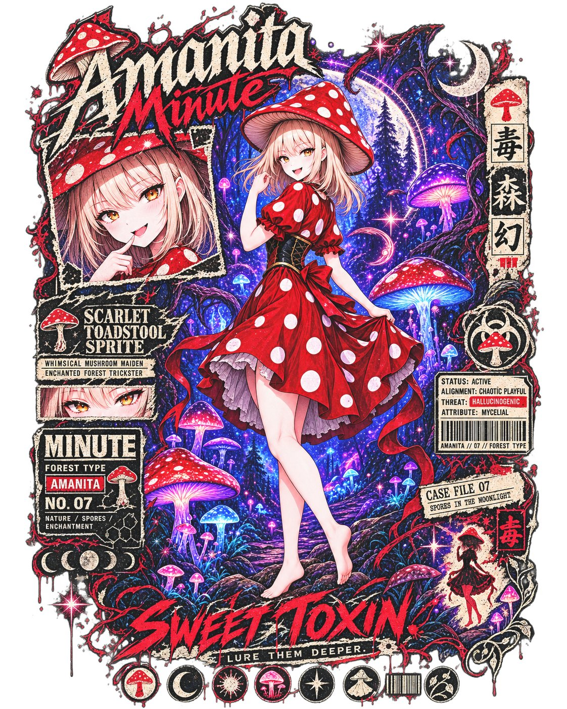
BEFORE YOU CREATE
MAKE IT YOUR CHARACTER.
- Supply a character sheet. Attach the reference images that define the character’s appearance.
- Customize the placeholders. Replace the bracketed fields with their name, personality, themes, colors, symbols, pose, and motto. Choose the options that fit their identity.
- Copy and create. Paste the prompt into your image generation chat along with the character sheet. The requested output is the graphic itself, with a transparent background and no shirt mockup.
THE COMPLETE PROMPT
ORIGINAL TEMPLATECopy the full template, then replace the bracketed fields in your chat. The text below is preserved from the supplied prompt.
Read the complete prompt
Universal Character-Sheet Streetwear Manga T-Shirt Graphic Prompt

Create a high-detail standalone T-shirt back graphic featuring the character provided in the supplied character sheet, designed in a distressed Japanese manga / underground streetwear collage aesthetic.

This template should adapt the graphic language, symbols, typography, environmental imagery, and supporting elements to the specific character rather than forcing every character into the same theme.

⸻

CHARACTER CUSTOMIZATION

Character Name:
[CHARACTER NAME]

Character Title / Alias:
[TITLE, CODENAME, NICKNAME, CLASSIFICATION, ETC.]

Character Archetype / Role:
[VIGILANTE / SOLDIER / MAGE / ASSASSIN / SAINT / DEMON / WANDERER / OUTLAW / IDOL / MONSTER HUNTER / ETC.]

Character Personality / Attitude:
[3–6 DESCRIPTORS — e.g. defiant, arrogant, melancholic, playful, ruthless, calm]

Primary Themes:
[FAITH / REVENGE / CHAOS / NATURE / TECHNOLOGY / WAR / DEATH / LOVE / FREEDOM / CORRUPTION / ETC.]

Primary Symbol / Emblem:
[DESCRIBE CHARACTER SYMBOL]

Secondary Symbols:
[LIST 2–6 RECURRING SYMBOLS]

Environmental Theme:
[DESCRIBE THE WORLD OR LOCATION ASSOCIATED WITH THE CHARACTER]

Primary Accent Color:
[COLOR]

Secondary Accent Colors:
[OPTIONAL COLORS]

Important Phrase / Motto:
[SHORT CHARACTER QUOTE OR SLOGAN]

Secondary Phrase:
[OPTIONAL SHORT PHRASE]

Reference / Number / Classification:
[001 / SUBJECT 07 / TYPE-A / UNIT 13 / ETC.]

⸻

CHARACTER REFERENCE — ABSOLUTE AUTHORITY

Use the supplied character sheet / character reference images as the sole authority for the character’s appearance.

Preserve with extremely high fidelity:

* facial structure
* hairstyle
* hair color
* eye shape
* eye color
* skin tone
* body proportions
* signature clothing
* footwear
* jewelry
* weapons
* scars
* tattoos
* markings
* distinctive accessories
* recurring visual motifs
* recognizable silhouette
* overall identity and attitude

If multiple views are provided on the character sheet, use them collectively to accurately understand the character’s design.

Do not redesign the character.

Do not replace them with a generic anime protagonist.

Do not simplify distinctive clothing or accessories unless required by the composition.

Translate their established appearance naturally into the illustrated streetwear / manga style while maintaining unmistakable character recognition.

⸻

MAIN COMPOSITION

Vertical oversized back-print composition, approximately 4:5.

The character occupies the dominant center-right or central portion of the composition.

Show the character approximately:

[THIGH-UP / KNEES-UP / THREE-QUARTER BODY / FULL BODY]

Preferred pose:

[DESCRIBE POSE]

Example:

Standing slightly turned away from the viewer while looking back over one shoulder.

Preferred expression:

[DESCRIBE EXPRESSION]

The character’s body language should communicate:

“[INSERT SHORT EMOTIONAL OR THEMATIC STATEMENT]”

Examples:

“I survived what was supposed to destroy me.”

“I already know how this ends.”

“You should have been afraid before I arrived.”

“Nothing here deserves my mercy.”

“I’m still standing.”

Signature clothing should retain its recognizable shape and layering.

Allow coats, capes, scarves, hair, ribbons, chains, straps, or loose clothing to move slightly as though caught by environmental wind.

If the character possesses weapons, they may be:

[HOLSTERED / SHEATHED / CARRIED / RESTING AGAINST SHOULDER / OMITTED]

unless an active combat pose is specifically desired.

⸻

VISUAL STYLE

Distressed Japanese streetwear graphic.

Blend:

* seinen manga illustration
* underground punk poster design
* vintage screen-print texture
* photocopied zine aesthetic
* distressed ink
* halftone dots
* rough brush strokes
* scratched borders
* torn-paper shapes
* messy manga panel construction
* weathered typography
* imperfect print registration
* faded ink
* subtle grunge
* fragmented propaganda-poster design
* industrial information graphics
* underground music merchandise aesthetics

The illustration should feel like artwork printed onto a heavily washed oversized streetwear T-shirt.

Do not make it resemble a clean digital anime poster.

The distressed physical-print appearance is essential.

Ink coverage should vary naturally.

Some areas should appear faded, cracked, scratched, overprinted, misregistered, or partially erased.

⸻

COLOR PALETTE

Base palette:

* charcoal black
* dirty off-white
* aged parchment
* ash gray

Primary accent:

[PRIMARY ACCENT COLOR]

Secondary accents:

[SECONDARY ACCENT COLORS]

Optional minor accents:

* faded military green
* burnt orange
* oxidized metallic tones
* faded blue
* muted yellow

Adapt these only when appropriate to the character.

Keep the palette restrained.

The primary accent color should dominate the visual emphasis rather than turning the artwork into a fully saturated illustration.

⸻

MAIN BACKGROUND PANEL

Behind the character, create a large crooked manga panel depicting:

[CHARACTER-SPECIFIC ENVIRONMENT]

Examples:

* burning modern city
* ruined cathedral
* neon cyberpunk district
* abandoned battlefield
* moonlit forest
* industrial laboratory
* gothic castle
* wasteland
* shrine complex
* flooded city
* supernatural dimension
* military compound
* decaying amusement park
* celestial landscape
* demon-infested ruins

Environmental storytelling should reinforce the character’s history, personality, faction, powers, or worldview.

Possible environmental details:

[LIST CHARACTER-SPECIFIC DETAILS]

Examples:

* damaged architecture
* smoke
* supernatural energy
* broken signage
* abandoned vehicles
* ritual markings
* shattered weapons
* corrupted vegetation
* propaganda posters
* religious structures
* military debris
* glowing machinery
* destroyed monuments
* ominous celestial objects
* distant landmarks

Avoid unnecessary background characters unless they are explicitly important to the concept.

The environment should feel narratively connected to the character rather than serving as generic scenery.

⸻

SECONDARY PORTRAIT PANEL

Upper-left portion of the design:

Create a large tilted rectangular close-up portrait of the character’s face.

Tight crop.

Heavy shadows.

Use dramatic manga rendering.

Optional:

* hair obscuring one eye
* shadow cutting across the face
* reflected light
* battle damage
* rain
* blood
* dust
* supernatural glow

Expression:

[CHARACTER-SPECIFIC EXPRESSION]

Add distressed halftone shading around the portrait.

Allow portions of the portrait panel to be scratched away, torn, photocopied, or interrupted by typography.

⸻

SYMBOLIC ELEMENTS

Scatter several smaller recurring graphic elements throughout the composition.

Primary Character Emblem

[DESCRIBE EMBLEM]

Render it like:

* scratched ink
* stencil paint
* damaged religious iconography
* military insignia
* graffiti
* photocopied symbolism
* screen-printed branding

depending on the character.

⸻

Secondary Symbol

[SYMBOL 2]

Meaning:

[OPTIONAL MEANING]

⸻

Secondary Symbol

[SYMBOL 3]

Meaning:

[OPTIONAL MEANING]

⸻

Faction / National / Cultural Element

Include:

[FLAG / FACTION SYMBOL / CLAN CREST / RELIGIOUS EMBLEM / CORPORATE LOGO / MILITARY PATCH / ETC.]

Do not render it as clean clip-art.

Make it appear:

* torn
* burned
* photocopied
* scratched
* partially obscured
* weathered
* stamped
* graffitied

⸻

Energy / Power Motif

If appropriate, incorporate small abstract representations of the character’s abilities.

Power Type:
[FIRE / LIGHTNING / BLOOD / SHADOW / HOLY LIGHT / MAGIC / ICE / DIGITAL GLITCH / ETC.]

These should function primarily as graphic motifs rather than overwhelming special effects.

⸻

Halo / Disc / Framing Device

Behind the character’s head, optionally place:

[BROKEN HALO / SUN DISC / MOON / TARGET RETICLE / MAGIC CIRCLE / TECHNOLOGICAL RING / SIGIL / ETC.]

It should feel integrated into the character’s lore.

Render it scratched, fractured, corrupted, weathered, or partially erased.

⸻

TYPOGRAPHY PANELS

Integrate several rectangular technical-information labels inspired by Japanese fashion graphics, military equipment markings, manga databooks, warning labels, industrial packaging, and underground music merchandise.

Use distressed condensed typography.

Suggested structure:

[CHARACTER SURNAME / BRAND / TITLE]

[CHARACTER CLASSIFICATION]

[CHARACTER NAME]

NO. [NUMBER]

[THEME 1] / [THEME 2] / [THEME 3]

Example:

NIGHTFALL

HUNTER TYPE

AKIRA

NO. 013

BLOOD / DUTY / REVENGE

⸻

Create another classification block:

STATUS: [STATUS]

ALIGNMENT: [ALIGNMENT]

THREAT: [THREAT TYPE]

ATTRIBUTE: [PRIMARY ATTRIBUTE]

Examples:

STATUS: ACTIVE
ALIGNMENT: UNKNOWN
THREAT: SUPERNATURAL
CONVICTION: ABSOLUTE

or

STATUS: WANTED
ALIGNMENT: CHAOTIC
THREAT: EXTREME
LOYALTY: NONE

Include a small barcode beneath it.

Under the barcode:

[CHARACTER BRAND] // [NUMBER] // [CLASSIFICATION]

⸻

JAPANESE TYPOGRAPHY

Use a few vertical Japanese text strips as secondary visual design elements.

Choose short words or phrases that genuinely fit the character.

Suggested customization:

Japanese Phrase 1:
[TEXT]

Meaning:
[TRANSLATION]

Japanese Phrase 2:
[TEXT]

Meaning:
[TRANSLATION]

Japanese Phrase 3:
[TEXT]

Meaning:
[TRANSLATION]

Keep Japanese typography secondary to the principal character branding.

Do not fill the design with meaningless random Japanese characters.

⸻

QUOTE / LORE DETAIL

Include one understated piece of lore, scripture, quotation, case-file information, mission designation, verse, warning, date, or reference relevant to the character.

Reference:

[REFERENCE / VERSE / DATE / FILE NUMBER / ETC.]

Text beneath:

[SHORT PHRASE]

Example:

CASE FILE 013

SUBJECT REMAINS ACTIVE

or

PSALM 23:4

FEAR NO EVIL

or

INCIDENT 08.17

NO SURVIVORS RECOVERED

Render this like information stamped onto military equipment, archival material, or industrial packaging.

⸻

LOWER GRAPHIC CLUSTER

Near the bottom of the design, create a dense collection of smaller symbols connected to the character.

Possible elements:

* character emblem
* faction insignia
* weapon silhouette
* supernatural symbol
* warning icon
* environment silhouette
* barcode
* flag fragment
* religious icon
* celestial symbol
* skull
* flower
* animal motif
* technological symbol
* broken crown
* chains
* stars
* eyes
* flames
* wings

Select approximately 5–8 elements that specifically fit the character.

Do not include symbols solely because they appeared in another design.

⸻

Add the primary phrase:

[IMPORTANT PHRASE / MOTTO]

And beneath it in smaller print:

[SECONDARY PHRASE]

Examples:

NO SAINTS LEFT HERE.

BURN. BLEED. RETURN.

or

THE NIGHT KNOWS MY NAME.

HUNT. SURVIVE. REPEAT.

or

HEAVEN NEVER ANSWERED.

STILL I PRAY.

⸻

CHARACTER-SPECIFIC ADAPTATION

Before constructing the final graphic, visually analyze the supplied character sheet and infer:

* dominant personality
* clothing aesthetic
* combat style
* supernatural or technological abilities
* faction
* cultural influences
* recurring symbols
* emotional tone
* historical period
* world setting
* likely visual motifs

Use those observations to determine which supporting design elements best reinforce the character.

The graphic should feel as though the entire streetwear design language was built specifically around this character.

Do not mechanically reuse unrelated elements from previous characters.

For example:

A religious vigilante may use crosses, scripture, damaged city imagery, halos, and propaganda.

A cyberpunk mercenary may use corporate warnings, circuitry, neon signage, serial numbers, and targeting interfaces.

A fantasy knight may use heraldry, cathedral architecture, swords, manuscript fragments, and medieval seals.

A vampire may use gothic architecture, blood motifs, moons, roses, family crests, and occult diagrams.

A nature-based character may use botanical illustrations, animal symbolism, weather patterns, and organic linework.

⸻

PRINT CONSTRUCTION

The artwork should have an irregular outer silhouette rather than being contained inside one perfect rectangle.

Allow:

* manga panels
* labels
* brush strokes
* text blocks
* symbols
* weapons
* hair
* coats
* capes
* effects
* environmental fragments

to extend beyond the central frame.

Use overlapping visual layers.

Some elements should disappear behind the main character while others cross over foreground portions of the composition.

The result should feel naturally constructed for a large oversized back print.

⸻

VISUAL HIERARCHY

Maintain approximately this priority:

1. main character
2. secondary facial portrait
3. character-specific environment
4. character name / branding
5. primary symbols
6. motto or quote
7. technical labels
8. Japanese typography and micro-details

Do not allow tiny decorative text to compete with the character.

At normal viewing distance, the viewer should immediately recognize:

the character → their theme → their identity.

Only afterward should the smaller details reveal themselves.

⸻

OUTPUT

Standalone graphic only.

No shirt mockup.

No human model wearing the artwork.

No room or environmental presentation background.

No hanger.

No clothing folds.

No mannequin.

Transparent background.

Centered vertical composition.

Approximately 4:5 aspect ratio.

Print-ready appearance.

Extremely detailed manga linework.

Weathered screen-print texture.

Distressed edges.

Controlled halftone shading.

High readability at T-shirt printing scale.

Premium underground anime streetwear aesthetic.

The completed artwork should feel like a collectible limited-run Japanese streetwear collaboration built specifically around the supplied character.